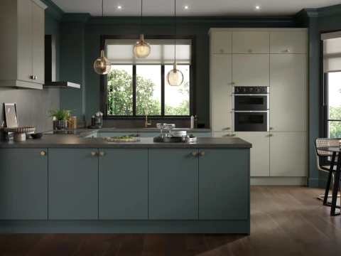
Superb quality vinyl wrapped doors in sophisticated styles


Colour Zoning in the Kitchen: Define Spaces with Paint
Open-plan living has become one of the most popular design choices in modern homes. Knocking down walls to create a bright, free-flowing space brings so many benefits: better light, more sociable layouts, and a contemporary feel that suits busy family life. But with openness comes a new challenge: how do you make each area feel defined without losing the sense of space?
That’s where colour zoning in the kitchen comes in. By using carefully chosen paint colours, you can subtly (or boldly) separate your cooking, dining, and living areas while still keeping everything connected. This technique not only makes an open-plan kitchen feel more functional, but it also adds style, depth, and personality to your home.
In this guide, we’ll explore how to use colour zoning effectively, the types of paint that work best in kitchens, and some of the premium paint brands available.
What is Colour Zoning?
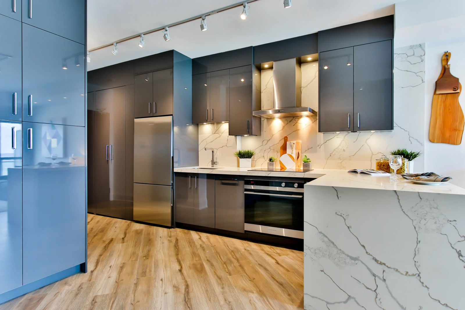
Colour zoning is the art of using paint to visually divide spaces without the need for walls or physical barriers. Instead of putting up partitions, you create “zones” by applying different colours to certain areas. For example:
A deep, dramatic shade behind your hob or cabinetry to define the cooking space.
A softer, warmer tone on the walls around your dining table to encourage relaxation and conversation.
A neutral or contrasting shade in the living/social area that blends everything together.
It’s a clever way to add structure and design intent to open-plan kitchens while still enjoying the flow of the space.
Why Colour Zoning Works in the Kitchen
The kitchen is the heart of the home, but in open-plan layouts, it often shares space with the dining and living areas. Without zoning, everything can blur into one, and you may lose that sense of function.
Here’s why colour zoning works so well in kitchens:
Creates a sense of order – Zoning makes each area feel purposeful, whether you’re cooking, entertaining, or relaxing.
Adds personality – Different colours can reflect different moods. For instance, a vibrant cooking zone can energise, while a calming dining space sets the tone for mealtimes.
Highlight features – An island, dining nook, or pantry wall can be accentuated with colour.
Flexibility without walls – Unlike permanent dividers, paint can be changed easily when your style evolves
Choosing the Right Colours for Your Kitchen Zones
Colour is incredibly powerful in shaping the atmosphere of a room. When zoning your kitchen, think not just about what looks stylish, but also about how you want each area to feel.
Here are some ideas to get started:
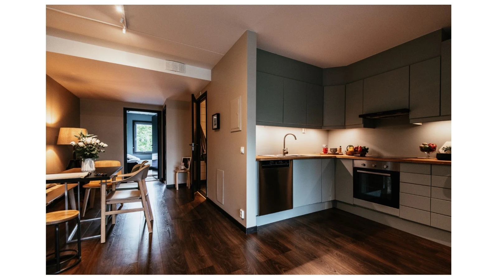
Cooking Zone: Bold and practical. Shades like deep navy, charcoal, or forest green create focus and hide splashes well.
Dining Zone: Warm and inviting. Terracotta, muted mustard, or soft sage can encourage relaxation and conversation.
Social/Living Zone: Light and calming. Soft neutrals like off-white, greige, or pastel blues keep things airy while complementing stronger kitchen shades.
You can also play with contrasts, for instance, pairing a dramatic accent wall in the kitchen with a lighter, more neutral tone in the dining area to make each zone pop.
Techniques for Colour Zoning in Kitchens
Colour zoning doesn’t just mean painting one wall differently. There are several creative approaches you can take:
Accent Walls
The simplest way to zone, paint one wall in a striking colour to clearly define a space.
Half Walls & Panelling
Paint the lower half of a wall in one shade and the upper half in another. This creates a chic, contemporary look and works beautifully around dining areas.
Ceilings & Overhead Zones
A bold colour on the ceiling above the kitchen island can visually “anchor” the cooking space without touching the walls.
Cabinetry Contrast
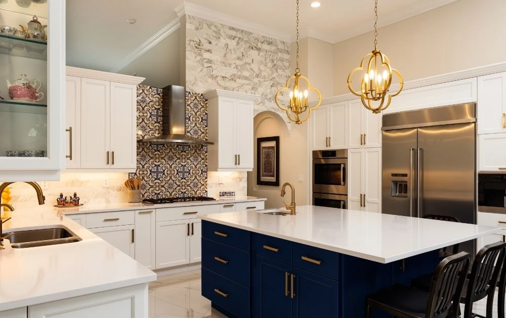
Use one colour for base cabinets and another for wall cabinets to separate prep areas from social zones.
Painted Arches or Shapes
Geometric shapes or arches painted directly on the wall can highlight breakfast nooks or reading corners.
The Best Paints for Kitchens
Kitchens demand more from paint than almost any other room. High moisture, heat, and the occasional splash mean you need a finish that looks beautiful and stands up to everyday use. At The Decorating Centre, you’ll find some of the best high-performance paint brands on the market, ideal for colour zoning in kitchens:
Benjamin Moore
Renowned for its rich pigments and durability.
Their Aura® Bath & Spa and Advance® ranges are particularly suited to kitchens, offering scrubbable finishes and exceptional coverage.
Huge colour palette perfect for bold zoning.
Little Greene
A British brand with a heritage of high-quality paints.
Their Intelligent Eggshell and Intelligent Matt Emulsion ranges are washable and durable – perfect for walls and cabinetry in kitchens.
Known for deep, timeless shades that bring elegance to zoning.
Eicó
Eco-friendly paints with exceptional coverage.
Resistant to dirt and moisture, making them ideal for busy cooking areas.
Great for homeowners who want sustainable choices without compromising on style.
Teknos
Durable, professional-grade finishes with excellent resistance to wear.
Their paints are ideal for cabinetry, woodwork, and high-traffic areas of the kitchen.
A smart choice for long-lasting zoning solutions.
By choosing premium brands, you’ll not only achieve beautiful results but also ensure your zones withstand daily life.
Combining Paint with Kitchen Restoration
Paint zoning works hand in hand with kitchen restoration projects. If you’re considering giving your kitchen a facelift, combining new paint colours with refreshed cabinetry or worktops can completely transform the space.
For example:
Restored cabinets painted in Little Greene’s deep navy paired with a warm neutral dining wall can make an open-plan kitchen feel both stylish and homely.
A newly restored island highlighted with Benjamin Moore’s bold green can act as the anchor point of the room.
Working with professionals such as Kitchen Restoration ensures the base of your kitchen is in top condition, while carefully chosen paint from The Decorating Centre adds the finishing touch.
Practical Tips for Colour Zoning in Kitchens
Test samples first: Light changes dramatically in open-plan spaces. Always test colours in different parts of the room.
Think about flow: Zones should contrast but also complement one another. Stick to a palette of 3–4 shades maximum.
Don’t forget finishes: Choose wipeable, scrubbable paints for high-use areas like behind the hob.
Balance with materials: Consider how colours interact with wood, tiles, or stone.
Future-proof your choice: Bold is beautiful, but think about whether the colours will still suit your style in five years.
Colour Zoning Inspiration
Here are a few combinations that work particularly well:
Moody Kitchen / Warm Dining: Charcoal cabinetry (Teknos) paired with a muted terracotta dining wall (Little Greene).
Bright & Airy: Fresh white cooking zone (Benjamin Moore) with pastel blue dining area (Eico).
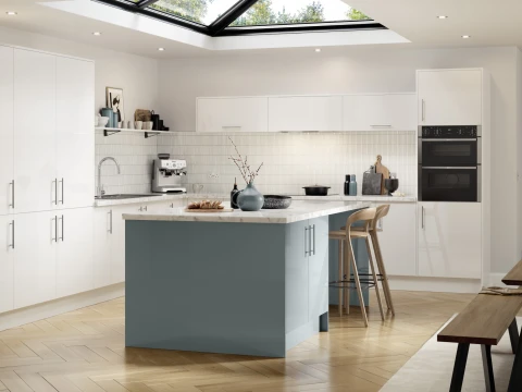
Nature-Inspired: Forest green island (Little Greene) with soft sage on surrounding walls (Benjamin Moore).
Bold Social Zone: Deep navy cooking space (Benjamin Moore) with a neutral greige lounge area (Teknos).
Colour Zoning Solutions
Colour zoning is more than just a trend; it’s a design solution that makes open-plan kitchens practical, stylish, and personal. With the right paints, you can highlight different areas of your kitchen while still keeping the whole room cohesive.
By combining expert kitchen restoration with premium paints from The Decorating Centre, you can completely transform your home. Whether you choose bold Benjamin Moore shades, timeless Little Greene colours, eco-friendly Eico options, or durable Teknos finishes, the possibilities are endless.
The Collection
Our kitchen ranges
Working with the highest quality brands